Mind Bloom


Before diving into wireframes, I began by creating a sitemap to define the core structure of the app. The goal was to support quick, low effort daily use while offering optional depth for users who wanted to reflect more or explore self care tools.

I prototyped wireframes to validate screen flow and content hierarchy before moving into UI design. The goal was to create a soft, intuitive layout with clear calls to action and gentle nudges.
I conducted remote usability tests with 4 participants using a low-fidelity Figma prototype. Participants provided live feedback while performing core tasks. Core findings and iterations include:
Home screen lacked continuity → Added a Weekly Progress section to reflect past check-ins
Journal screen caused confusion → Introduced a clear “Start New Entry” button at the top
Emoji mood tracker was well-received → Kept feature and added accessible labels for clarity

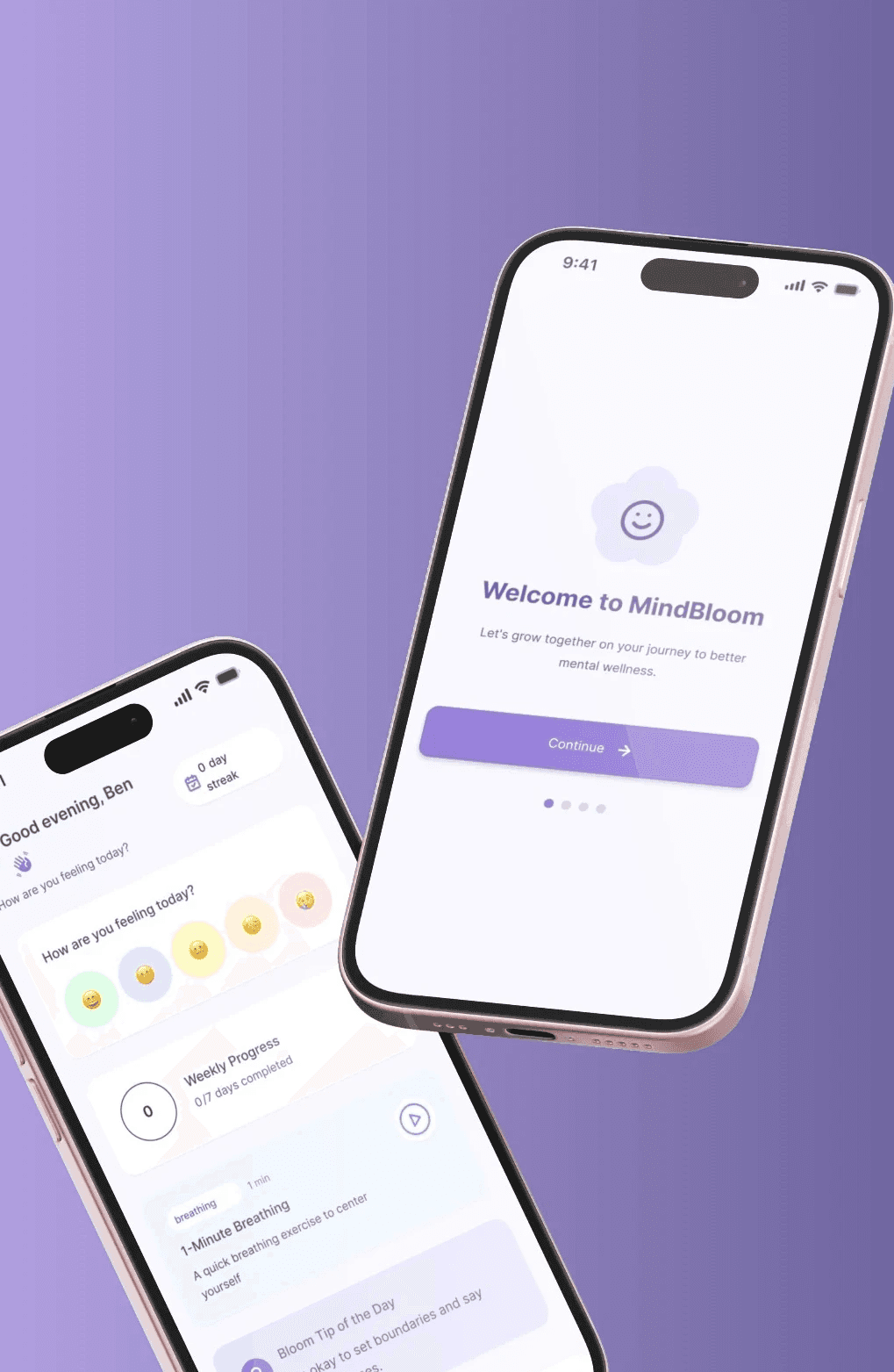
The final UI is clean, calming, and emotionally supportive. Soft colors, rounded typography, and gentle animations create a soothing experience. Key screens include:
Home – Personalized greeting, mood check-in, and daily practice
Mood Tracker – Emoji-based input with optional journaling or voice notes
Guided Practices – Short mindfulness exercises with ambient sound options
Journal – Card-style entry list with tags and new entry flow
Insights – Mood trends, usage streaks, and progress tracking
The design prioritizes simplicity, emotional clarity, and accessibility for daily use.
MindBloom Mobile
What Worked Well
The mood check in flow felt natural and intuitive, users responded positively to the emoji-based interface.
The calming visual design successfully reinforced the emotional goals of the app.
Onboarding was well received during testing
What I’d Improve
I would conduct a second round of testing with a broader range of users, especially those with accessibility needs.
The Insights screen could benefit from more customization options to make progress tracking feel more personal.
Adding more language options and cultural sensitivity features would make the app more inclusive.
What I Learned
Designing for mental wellness requires a delicate balance of clarity, softness, and trust.
Emotional UX is just as important as functionality. Tone, spacing, and microinteractions all shape the user’s emotional experience.