Cover
Cover
Cover

Smart Pantry

Project Overview

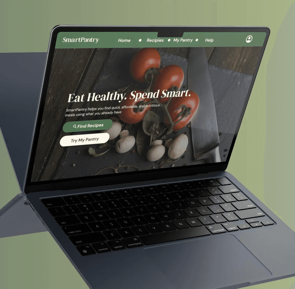
  • Project Title: Smart Pantry – A Responsive Web App for Healthy, Budget-Friendly Recipes

  • Timeline: 4 weeks, Spring 2025

  • Role: UX Designer

  • Tools Used: Figma

  • Scope: Responsive website design, including homepage, recipes page, pantry finder, and help center.

Smart Pantry is a responsive web app that helps users find healthy, affordable meals using what they already have at home. Designed with beginner cooks and budget-conscious users in mind, it combines recipe search, pantry tracking, and smart filtering in a clean, mobile-friendly interface.

The Problem

Many people want to cook healthy meals at home, but are limited by budget, time, or uncertainty about what to make. Existing recipe apps don’t focus on cost, and few offer features to help users work with what they already have at home. This results in food waste, frustration, and over-reliance on takeout.

The Goal

Design a responsive web platform that empowers users to:

  • Find healthy, low-cost recipes

  • Search based on ingredients they already have

  • Filter by time, dietary needs, and difficulty

  • Feel confident and less overwhelmed in the kitchen

Design a responsive web platform that empowers users to:

  • Find healthy, low-cost recipes

  • Search based on ingredients they already have

  • Filter by time, dietary needs, and difficulty

  • Feel confident and less overwhelmed in the kitchen

User Research

I conducted a social media survey with 18 participants and held 3 user interviews. Key insights found included:

  • "I don’t know what to cook unless I follow a strict meal plan."

  • "I hate when I’m missing one random ingredient."

  • "I want cheap and fast meals, but still healthy."

From this, I developed two primary personas:

Jamie – The Busy Grad Student

  • Age: 23

  • Goals: Quick, healthy meals after class

  • Frustrations: Doesn’t know what to cook, hates food waste

  • Quote: “I need to use what I have or it goes bad. I can’t keep buying new stuff.”

Ray – The Budget-Conscious Parent

  • Age: 39

  • Goals: Feed their family healthy food on a budget

  • Frustrations: Expensive meals, picky eaters, dietary restrictions

  • Quote: “I need meals that check multiple boxes: cheap, healthy, and kid-friendly.”

Information Architecture

After defining the core tasks, I created a sitemap to structure the site clearly and minimize mental load.

After defining the core tasks, I created a sitemap to structure the site clearly and minimize mental load.

User Flow Example:
Jamie wants to use leftover asparagus and quinoa to cook dinner:

  1. Navigate to MyPantry

  2. Input ingredients

  3. Navigate to My Recipes

  4. Filter by cook time and dietary preference

  5. Select recipe and follow steps

User Flow Example:
Jamie wants to use leftover asparagus and quinoa to cook dinner:

  1. Navigate to MyPantry

  2. Input ingredients

  3. Navigate to My Recipes

  4. Filter by cook time and dietary preference

  5. Select recipe and follow steps

Wireframes and Ideation

I created low-fidelity wireframes for key pages:

  • Homepage: Emphasizes cost-saving features, CTA to Recipes and MyPantry

  • Recipes Page: Grid layout, filters for time, cost, diet

  • Pantry Finder: Ingredient input, smart matching

  • Help Page: Simple FAQ layout with search bar

These helped clarify layout hierarchy, interaction flow, and responsive behavior.

Usability Testing & Iteration

Usability Testing
& Iteration

I tested an interactive lo-fi prototype with 5 users. Key feedback and actions:

  • “Color choices were not accessible” → Raised contrast among colors.

  • “Filter menu was too hidden on mobile.” → Made filters visible by default on small screens.

  • “Couldn't tell which ingredients were already entered into MyPantry.” → Implemented an "ingredient" section.

These iterations ensured key features were discoverable and intuitive.


Final Designs

Final High-Fidelity Screens include:

  • Homepage: Hero CTA, feature highlights, recipe preview

  • Recipes Page: Filter feature, tags for cost/time, save options

  • Pantry Finder: Search-based ingredient entry, matching recipes, filter feature

  • Help / FAQ: Frequently asked questions, search, responsive layout

  • Mobile + Desktop Views: Optimized layouts for different screen sizes

All designs use the DM Serif Display + DM Sans font pairing for clarity and warmth. The brand color palette is fresh and modern: greens, neutrals, and soft accents.

Reflection

What Worked Well:

  • MyPantry was very well received during testing

  • Responsive layout adapted smoothly

  • Navigation between pages was unproblematic

What I’d Improve:

  • Add sign-in to save pantries and favorites

  • Reach out to a more diverse pool of individuals for user testing

What I Learned:

  • Compositional techniques when it comes to responsive-web designing

  • Significance of accessibility in my designs

  • Test early and often

Interested in working together or want to learn more about my work? I’d love to hear from you — let’s connect.

Available For Work


benvibas22@gmail.com

Interested in working together or want to learn more about my work? I’d love to hear from you — let’s connect.

Available For Work


benvibas22@gmail.com

Interested in working together or want to learn more about my work? I’d love to hear from you — let’s connect.

Available For Work


benvibas22@gmail.com