The Met App


Project Overview
Project Title: The Met App
Role: UX Designer (Solo)
Timeline: 6 weeks, Fall 2024
Tools Used: Figma
Project Type: Mobile App
Summary:
The Met App is a mobile application designed to help visitors explore current exhibitions, discover events, and plan visits to The Metropolitan Museum of Art. The app aims to simplify the digital museum experience with an elegant and intuitive design aligned with the museum’s identity.
The Problem
Design a mobile experience that allows users to:
Discover current and upcoming exhibitions
Explore daily events and programs
Schedule and confirm visits easily
Access essential information quickly and beautifully
The Goal
To better understand how visitors interact with cultural institutions digitally, I reviewed existing museum apps, analyzed visitor feedback online, and conducted informal interviews with casual and frequent museum-goers.
Key insights included:
“I just want to know what's on today and plan around that.”
“It’s hard to find exhibit information without having to scroll through a lot of pages.”
“I don’t want to deal with a complicated ticketing system.”
From these insights, I developed a primary user persona:
User Research

Alex – Typical Museum Visitor
Age: 31
Goals: Quickly browse what’s currently on view and plan a visit
Frustrations: Feels overwhelmed by museum websites, dislikes unclear ticketing processes
Quote: “I want a museum experience that starts from my phone, not at the front desk.”

Information Architecture
I designed a simple information hierarchy focusing on discoverability and ease of use in order to make a smooth user flow
User Flow Example:
Alex wants to see what exhibitions are open today and plan a visit:
Open app → Home
Tap on featured exhibition → Information
Navigate to “Plan Your Visit” → Select date/time
Review Visit → Confirm reservation


LoFi Wireframing
Low-fidelity wireframes helped define layout, structure, and key interactions, focusing on:
A strong visual hierarchy for exhibits
Quick access to “Plan Your Visit” from multiple touchpoints
Simple onboarding with no login required

Usability Testing
Using a High-fidelity prototype, I tested the app with 4 users. Feedback helped improve usability:
“Visit confirmation seemed too sudden.” → Added a review screen with visit details.
“The calendar was difficult to select my date and time.” → Added date and time dropdown tabs.
“Couldn't find where other exhibition details were.” → Altered the caroussel.
These updates enhanced the overall clarity and flow of the user experience.

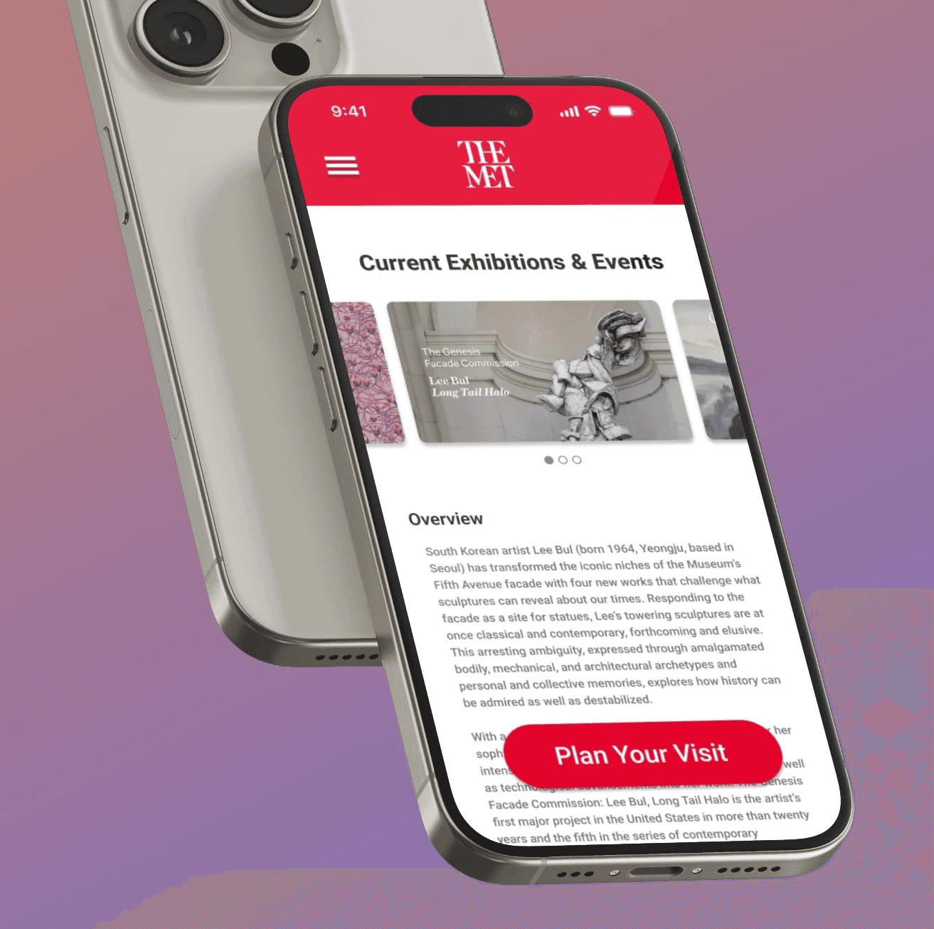
Final Designs
High-Fidelity Screens Include:
Home: A refined landing screen showcasing current exhibitions and events
Exhibitions Page: Elegant visuals, clear entry points into exhibit details
Exhibit Details: High-res imagery, short descriptions, and date/location info
QR Code Entry: Popular and effective feature used among ticketed events
Visit Scheduler: Simple flow for selecting date, time, and guests with confirmation
The visual design is inspired by The Met’s classic aesthetic using a serif typeface, rich artwork, and limited color palette to let the art take focus.
TheMet Mobile
Reflection
What Worked Well:
Static "Plan Your Visit" button
Visual clarity and detailed artwork created an immersive experience
Navigation and scheduling flow was smooth during testing
What I’d Improve:
Add membership logins so the app can remember certain requirements
Add accessibility features for better readability and interaction
Explore integrating an interactive museum map for in-gallery navigation
What I Learned:
Designing for a public institution such as The Met requires balancing clarity and brand identity
Mobile users prioritize speed and simplicity, so I had to simplify my designs in some stages
The process behind the final design is crucial in order to result in the best end product